Rainbows: the Original Hawaiian Supergraphic
This is taken from the essay “Rainbow Print Narrative” — part of the RISD Museum’s collection along with samples of this print.
I have a tendency to overthink things. I decided I needed to make a simple print. I was hoping for a “banger” print. A “banger” is a good pop song; catchy and irresistible. So I decided to work with rainbows.
Before there was even an idea of something called “supergraphics” ( large scale colorful graphics, used liberally in 1970s interiors that alter the sense of space), Hawaiʻi had natural supergraphics- rainbows. Lots of rainbows. Everyday rainbows. Predictable, four o'clock in every valley rainbows. An embarrassment of rainbows.

Classic Oahu rainbow. Photo: Getty Images
The rainbow is so associated with Hawaiʻi that just having it in a print means Hawaiʻi. I wondered how to breathe new life into this form.
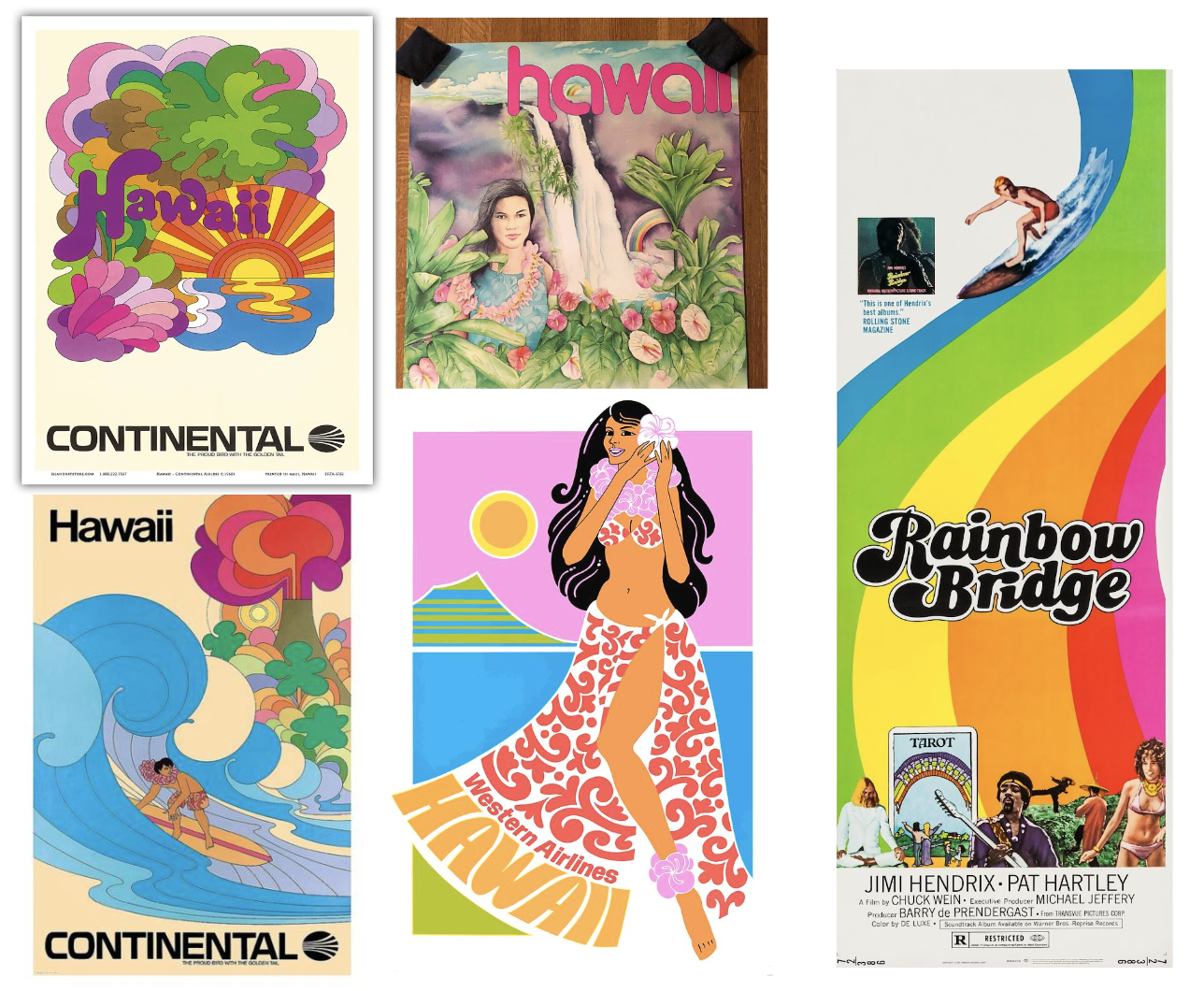
Assorted Hawaiian tourist posters
I had a hodgepodge visual file of Hawaiian tourist-y rainbow things, the most iconic and kitsch being the Millard Sheets twin rainbow ceramic tile murals on the towers at Hilton Village Waikiki.
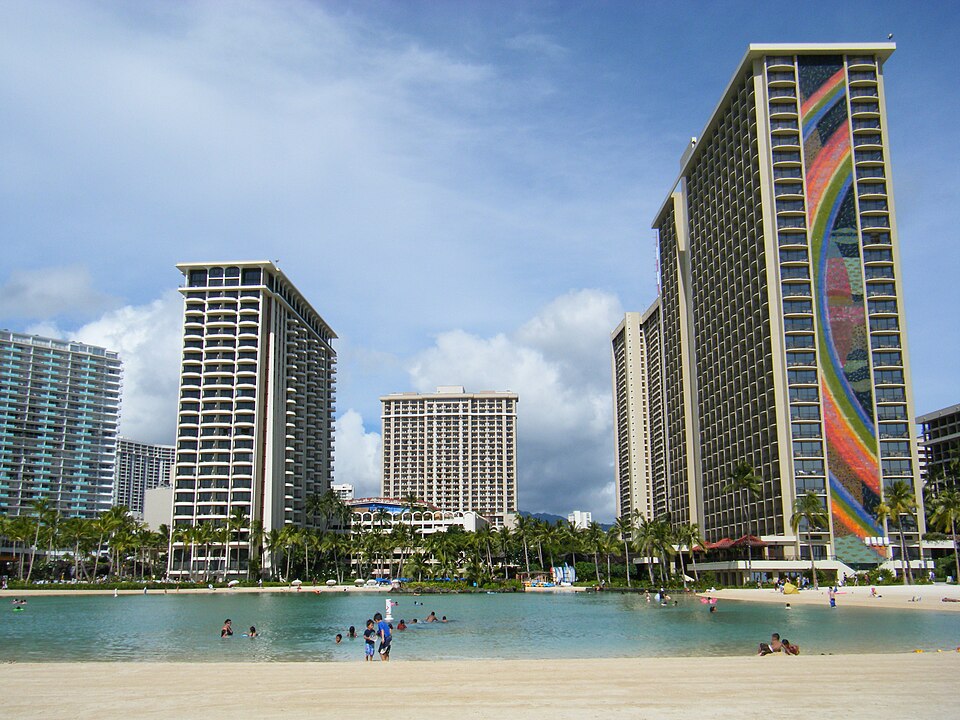
Hilton Village Waikiki. Photo: Travis Thurston
I find it a strange choice for an environment that produces much more impressive natural examples on a daily basis. But it becomes clearer when you understand that this whole “village” development was conceived to give its guests a full “Hawaiian experience” without ever leaving the resort. In the 1950s this was a groundbreaking concept. I suppose they had to guarantee rainbows for their customers.
By 1975 this type of project was fully skewered in Umberto Eco’s Travels in Hyperreality yet it remains intact to this day. It is basically everything wrong with the tourism in Hawaii and somehow, probably because of its kitsch, endearing. So this is what I was mentally pushing around/against in developing this print.
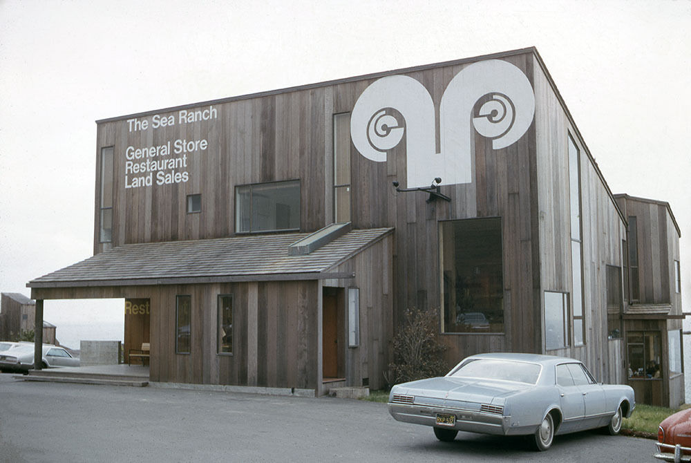
Sea Ranch, CA. Barbara Stauffacher Solomon signage.
My lodestar for this print was the work of San Francisco-based artist/designer Barbara “Bobbie” Stauffacher Solomon at the Sea Ranch development in Northern California. Solomon single handedly invented Supergraphics in the 1960s while working on Sea Ranch.
Like Hilton Village Waikiki, Sea Ranch is another vacation village model plunked down in another terrifically beautiful landscape. However this development, best described as an architectural triumph and a financial fiasco, I think, has created something greater than a hyperreal simulation of its environment.
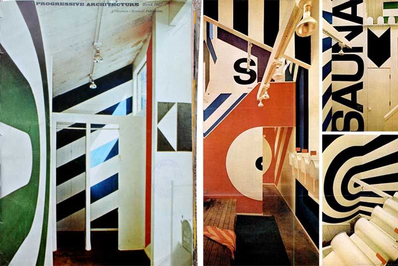
Barbara Stauffacher Solomon for Moonraker Athletic Club, Sea Ranch, CA. Progressive Architecture Magazine
As an experiment it failed the intentions of its architects as described by Lisa Dundee an architect an executive director at the Sea Ranch Association:
"I’m sure you’ve heard from others that in the ’60s the idea was to be a very multi-class, bohemian population—artistic, intellectual, all sorts of people. And in the beginning, there were to be many more condominium units than currently exist. The unfortunate thing for the Sea Ranch is, it became a victim of California real estate trends. So as they were trying to sell the condominium units, the developer of course found that it was much more profitable to sell a single-family home."
And perhaps it was destined to fail these utopic intentions. From the start it privatized beach access, creating a gated “prestige community.” As Solomon pointedly comments
“All the money I made, I bought a house at Stinson, not at Sea Ranch. I was the only who took my money and did that. At Stinson people can walk along the beach.”
Solomon worked at the architecture firm developing Sea Ranch and created these supergraphics as a way to deal with cost overruns:
“According to Solomon, the only reason she opted for supergraphics was because the Sea Ranch project had run out of money too early on to put a proper finish on the buildings. Using ultramarine blue, red, black and white, she created huge minimalist wave patterns on the walls for one building. And the rest followed.”
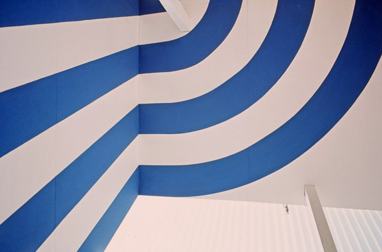
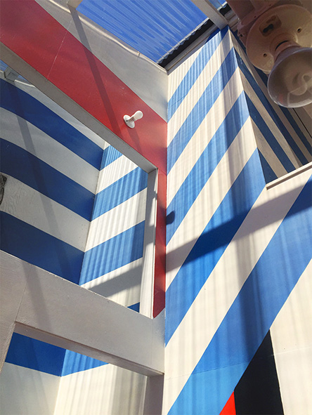
Supergraphic details. Barbara Stauffacher Solomon for Moonraker Athletic Club
As Solomon says herself:
“ I combined the super-sized enthusiasm of California Abstract Expressionism with hard-edge Swiss graphics, and ended up with, however superfluous and superficial, supergraphics.”
I stayed at Sea Ranch in the late 1990s and made a mental note of the work though I didnʻt know at the time who made it. What really stuck with me about Stauffacher Solomon’s supergraphics was the experience of moving through them in space, how they implied and suggested movement, how they crushed up the space rather than being decorative, how crisp and uncompromising they were, their playfulness while still being functional as wayfinding, the uncompromising palette choice and the way they were married to that place.
It was, to me, a sublime experience.
Development
I started my design by removing the color from the rainbow and focusing on shape and scale. I striped it down to the type of graphic mark reminiscent of Solomon’s work. I felt like I got the scale “right’ in that you could only see part of the rainbow at a time. It felt true to the experience of an actual rainbow. It also captures some of the space altering-ness of her supergraphics and does something strange to the body when worn.

WIP Paper test proof.
However I found this a little unsatisfying in implementation. Even when I used a color gradient background to “knock out” the rainbow. Though I had produced a working, finished print, I decided to go back and try again.
The problem with the full spectrum rainbow is it feels kitschy. I tried to think through what made rainbows magical.
It wasn’t the colors per se but the transparency of the color. Because rainbows are made out of light rather than pigment. This was my eureka moment.
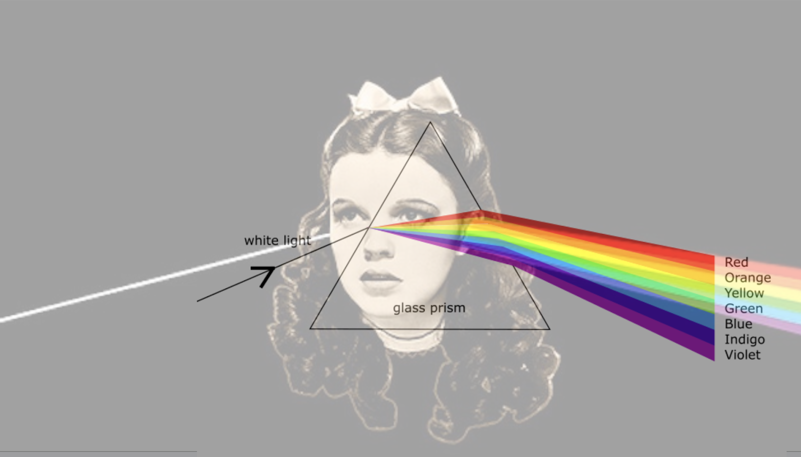
Light not Pigment. My eureka moment is expressed as a Wizard of Oz/Pink Floyd meme.
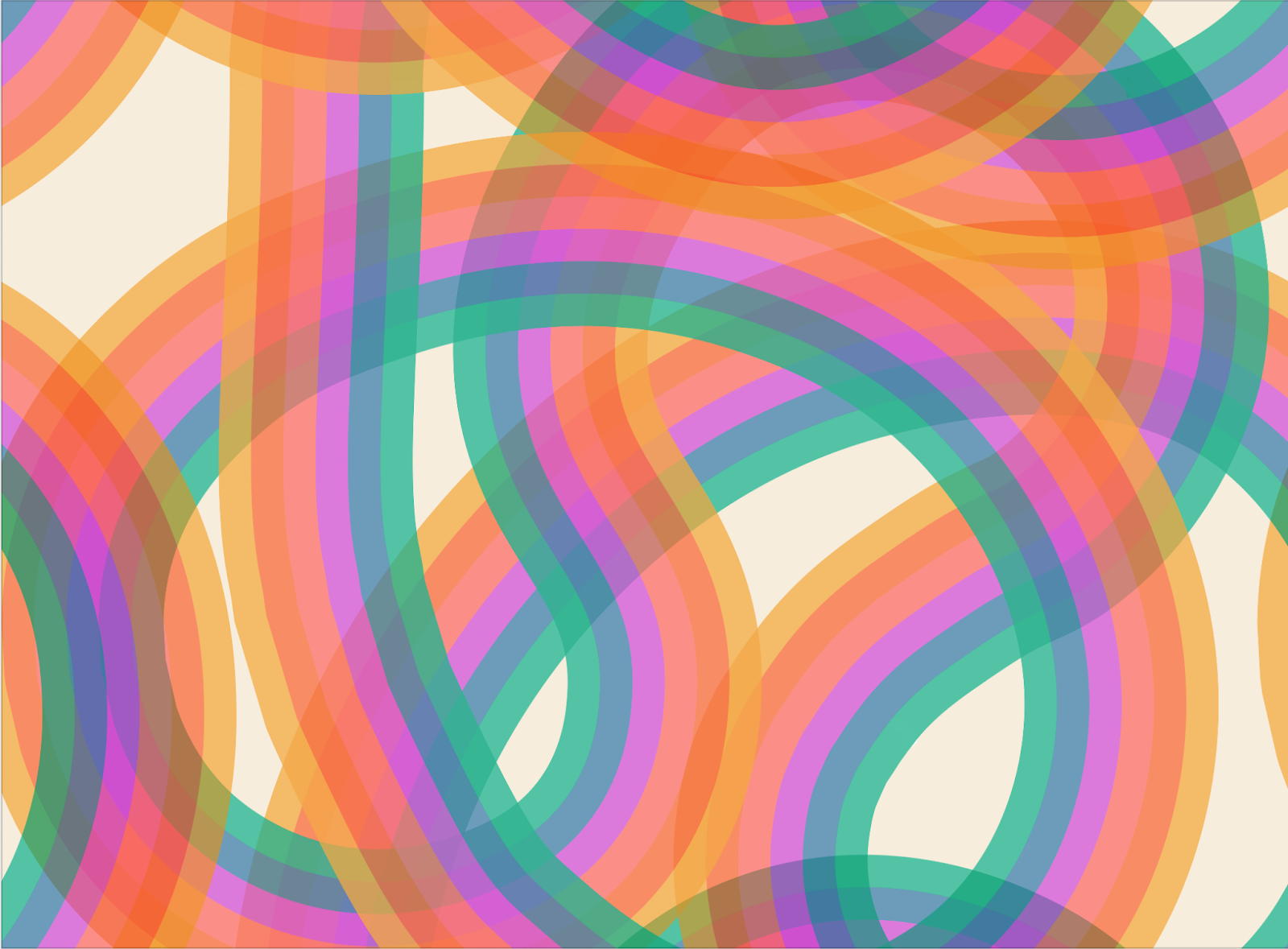
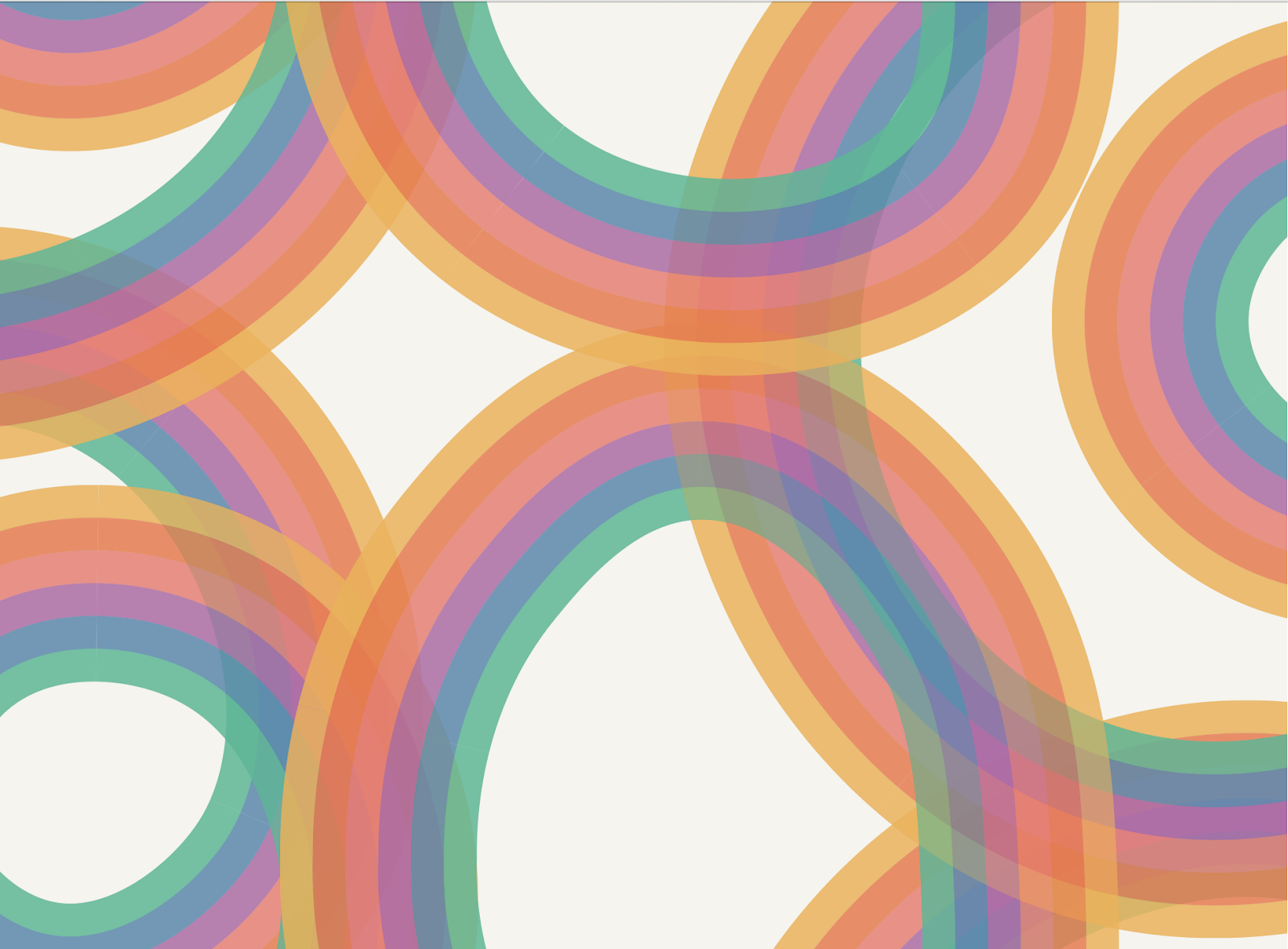
I took this as an opportunity to explore the fullness of digital printing and not restrict color as I had to with my silk screens. I developed a brush in Adobe Illustrator with slight transparency. This way when the mark crossed over itself it created more color variations.

|
|
Screen capture of the mark crossing itself. Early test of the print 2020
As the most interesting moment was when the color crossed over itself (like in a plaid) I decided to focus on that in the structure of the print.
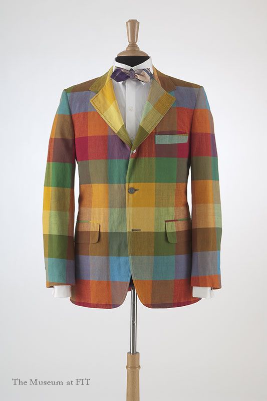
It reminded me of bright rainbow plaids in 1950s -60s Ivy style.
|
|
Chipp Sack coat 1970, FIT collection; Martin of California surfer jackets 1960s
I had a realization that this digital brush itself was the print. I discovered that the scale of the mark was the most important thing to the integrity of the pattern. When I reduced the scale of the brush the pattern no longer worked. Its scale determined how much it could loop over itself without breaking. It took me a few years (and some really terrible outputs) to understand this fully.
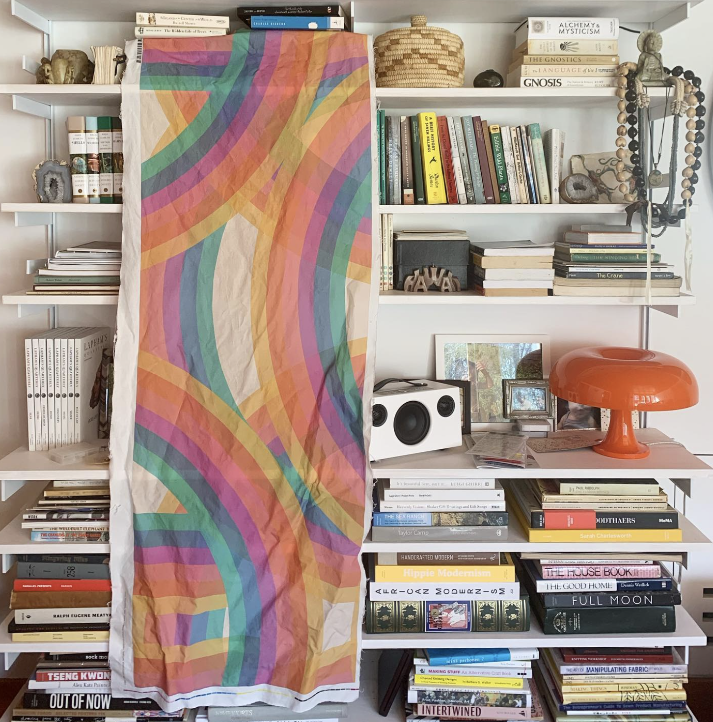
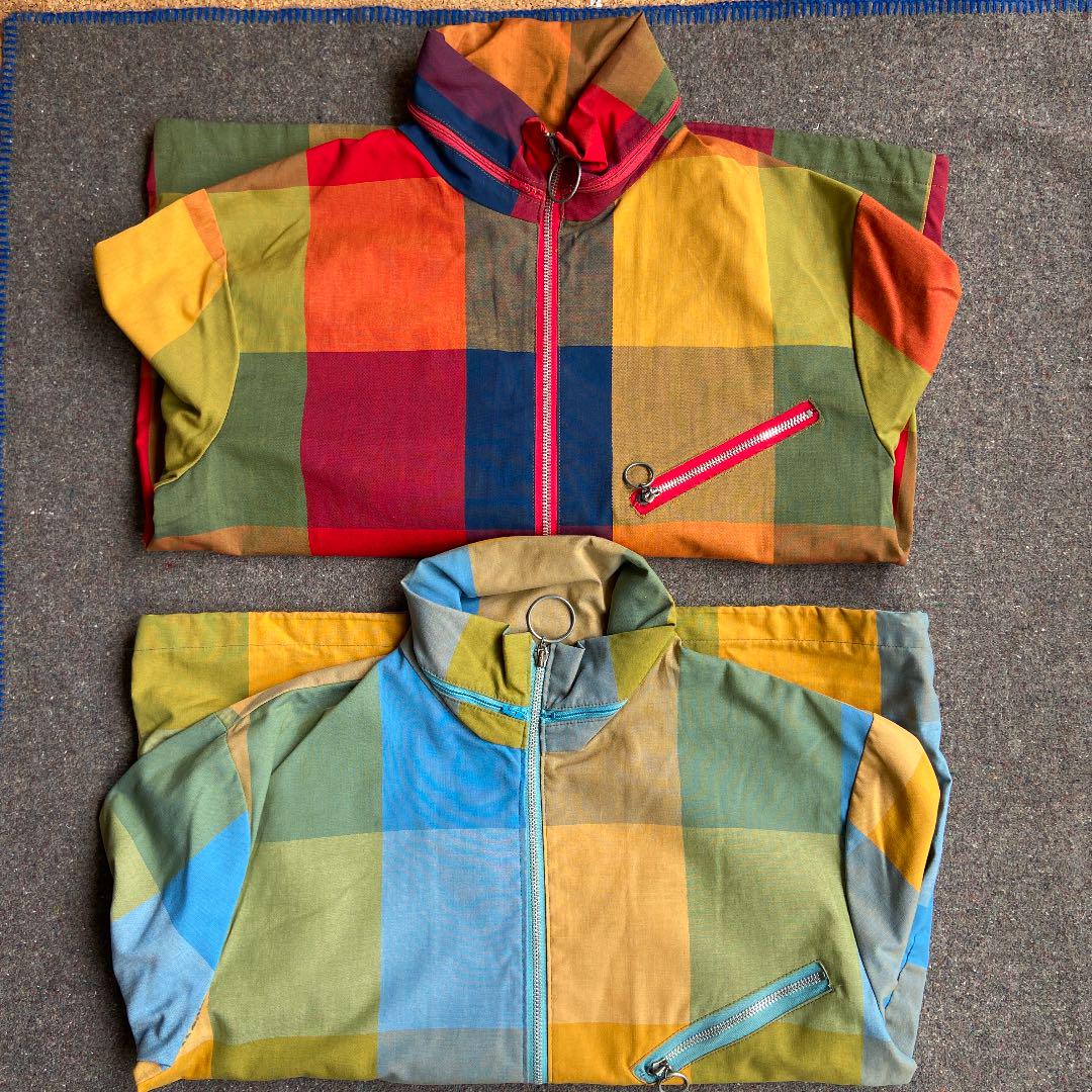
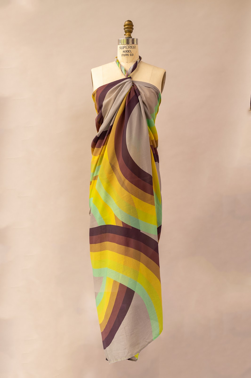
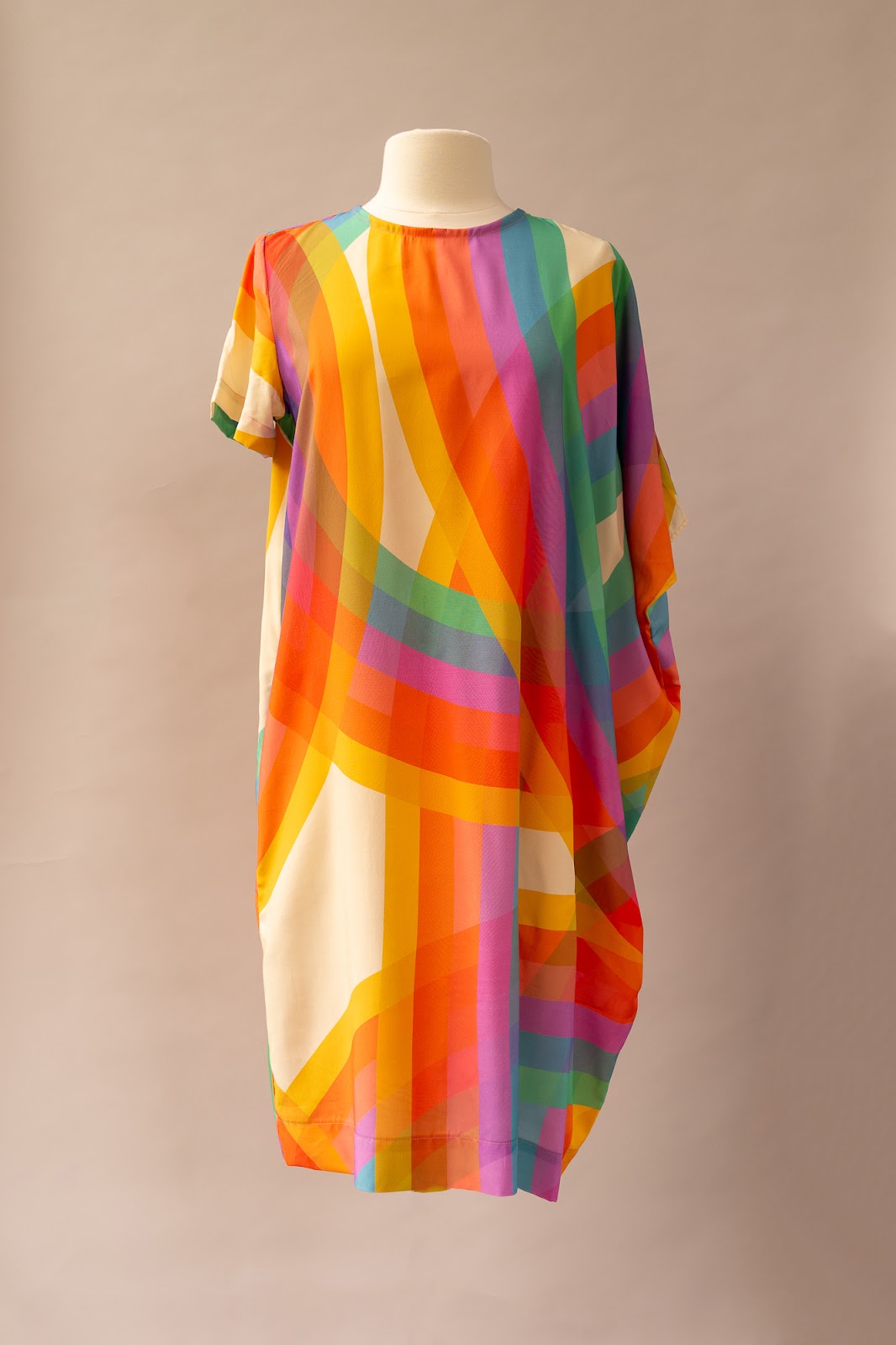
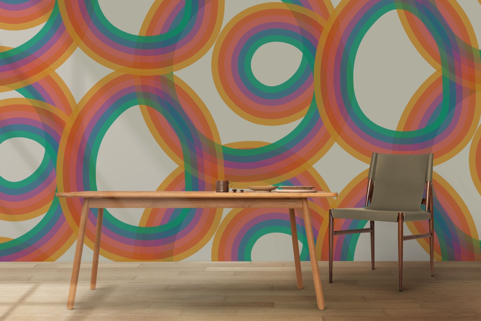
Therefore the print could exist in different expressions based on context. For example with a clothing item you need a much denser print than with wallpaper. I developed repeat and variations. I developed a number of different palettes just to push around what a “rainbow” could be.
Repeat for clothing vs wallpaper
|
 |
Palette brush variations.
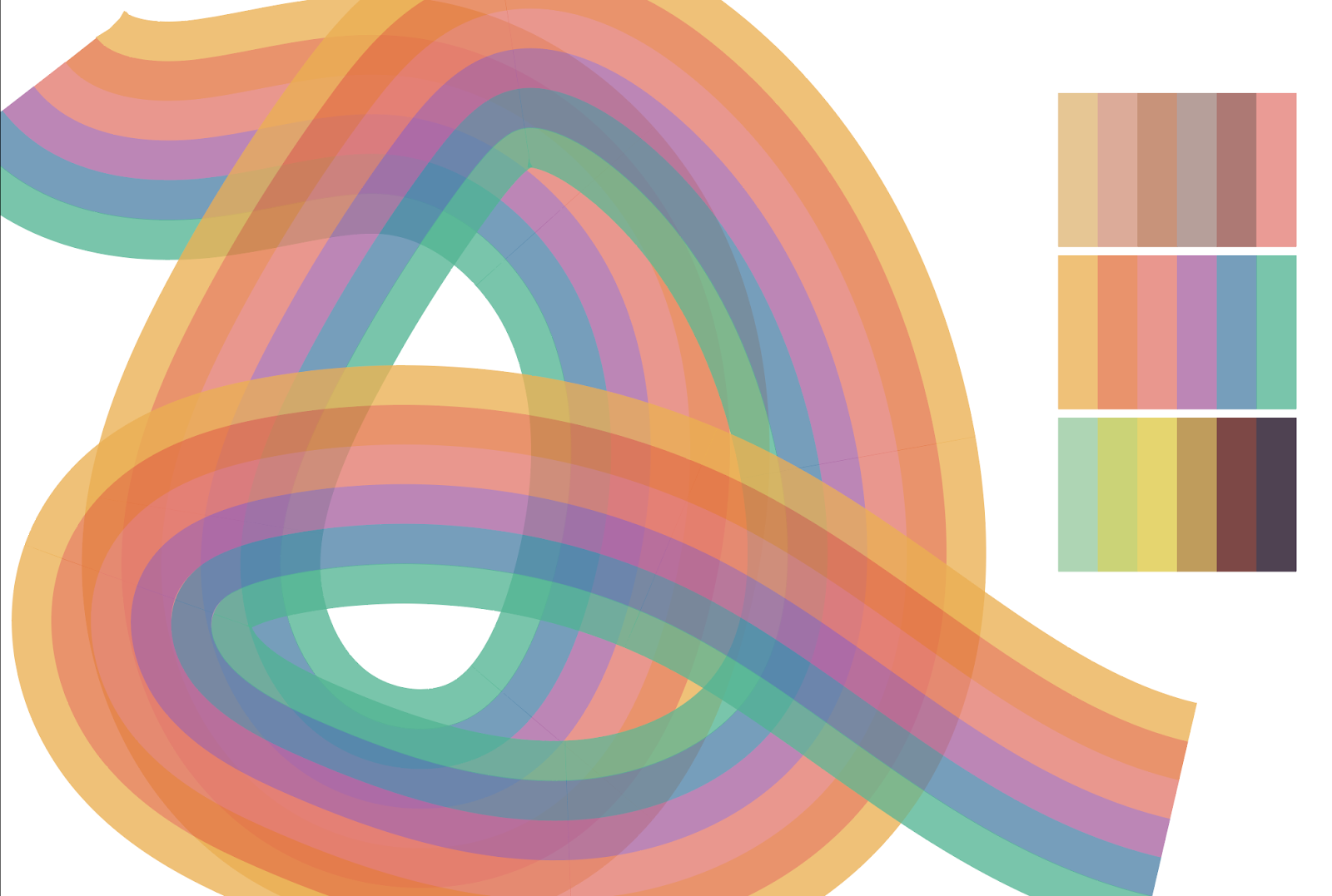
Here it is executed it across a number of contexts/palettes:
Apparel in “saturn” and “true” palettes
|
|
Wallpaper
|
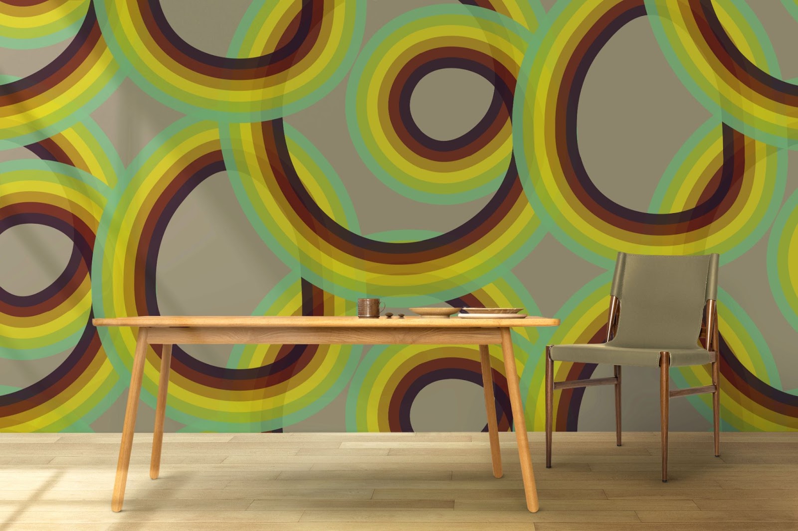
|
On humans.
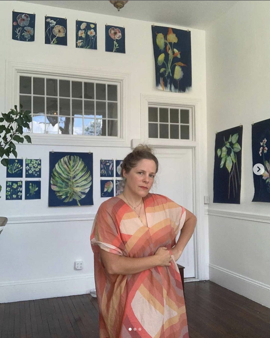
|
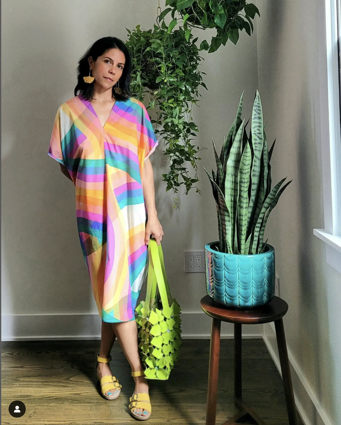 |
 |
|
Artist Brett Windham, Influencers Dee Dee Disanto, Shoko Von Werder, and the designer.
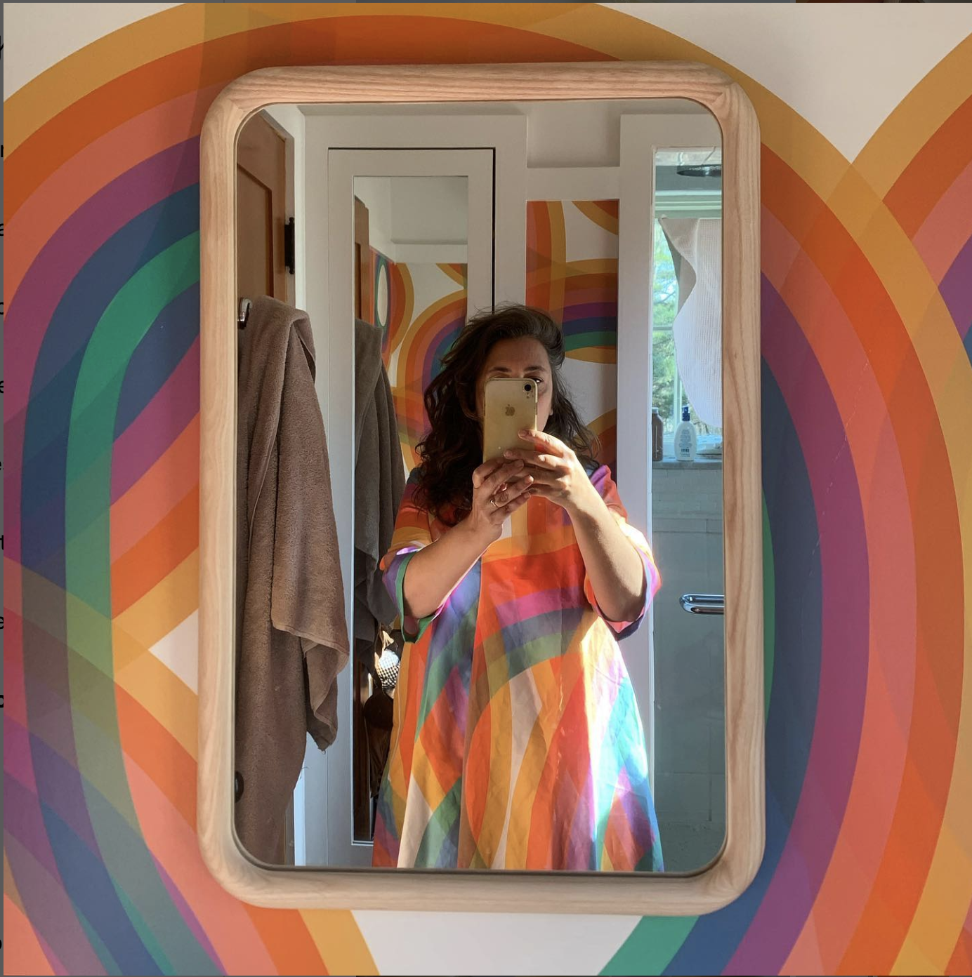
Then I placed it back in Hawaii in front of part of its own inspiration, like a magic trick.
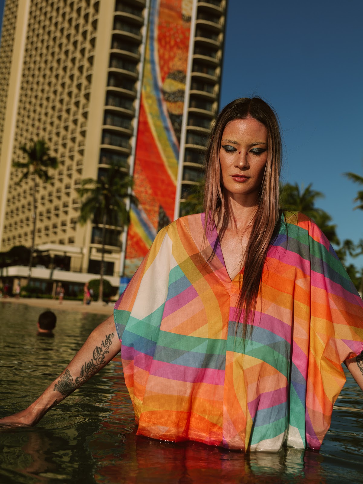
Kaftan with Sheets’ tile murals, Hilton Village Waikiki. Photo: Josiah Patterson
Sources
Keith, Kelsey. “‘Paradise at the End of the World’: An Oral History of the Sea Ranch (Part I).” Curbed, February 20, 2019.
Labong, Leilani Marie. “The Iconic ’70s Design Trend That’s Back in a Big Way” Food 52 February 18, 2022.
Long, Molly. “Barbara Stauffacher Solomon: ‘I Designed Because I Needed to Eat.’” Design Week, March 1, 2021.
Swenson, Eric. “Barbara Stauffacher Solomon : The Invisible.” YouTube December 17, 2020.
Tilton, Shannon. “The Most Influential Designer You’ve Never Heard of Is a 92-Year-Old Artist in SF.” Kenneth Caldwell, July 16, 2021.